Design Best Practices for Ecommerce Order Tracking Pages

When it comes to designing your order tracking pages for your ecommerce site it’s not exactly less is more OR more is more. The truth is that being consistently on brand is more, but that doesn’t exactly roll off the tongue.
What I mean is, when you’re designing the order tracking pages for your ecommerce store the primary goal should be to create an amazing post-purchase experience. Sounds easy enough, right?
The truth is, when designing transactional pages like order tracking pages sometimes we make them feel, well, transactional. We have the impulse to over-design them to make up for their boring nature, or we swing completely the other way and under-design them as a way of giving up on the idea.
Let’s face it, sending customers to the carrier’s website is not an ideal experience. Sure it does the job, but you can do better.
What if you could send consumers back to YOUR website and not to another site like USPS, FedEx, or DHL? Think of all that high-qualified traffic you might be losing. Order tracking pages are one of the best opportunities to increase retention and loyalty: transparency around shipping is critical.
Now that we got the why out of the way, let’s walk through the elements of an ecomm tracking page and some top examples of pages that go above and beyond for some design inspo.
Elements of an Ecommerce Order Tracking Page
The primary goal of every ecommerce order tracking page is the same: to reduce customer anxiety.
Creating a standout page that not only serves to inform, but also to educate, comes down to how you design your order tracking page.
Let’s see what are the need-to-haves, nice-to-haves, and super-nice-to-haves when creating tracking pages.
The Necessary Details
The singular purpose of ecommerce order tracking pages is to tell your customers that their order has shipped and give them the tools to track it. Before you can put your creative hat on, your order tracking page must include:
- A breakdown of items in the order
- Shipping date and expected delivery date
- Order # and tracking #
- Shipping address (destination)
- A tracking link to see the details of the order’s shipping journey
How to Customize Your Tracking Pages
Once you’ve hit all the necessary details, it’s time to start designing your order tracking page. The primary goal of this design: customization. With marketers seeing an average increase of 20% in sales when using personalized experiences, it’s a great opportunity to segment or customize and create a better experience for the user (and a higher chance for conversion.) Win win.
And remember what I said earlier about staying consistently on brand? This is where it comes in to take your order tracking page from blah to branded.
Here are a few simple ways to customize your order tracking pages:
- Link to your company social media accounts to engage with customers on a more personal level
- Design the page to match the rest of your company pages, it’s all about consistency
- Include aesthetically pleasing graphics and photos that match the tone of your other emails
- Incorporate company branding images and copy to finalize turning what could be a boring transactional email into a killer marketing opportunity
This is where you want to turn a boring experience of tracking something you’re otherwise excited to receive into an interactive, engaging moment to create a moment with a customer you would have otherwise missed out on.
Want to create ridiculously good looking tracking updates for Shopify? See how Wonderment can help and try it out for free.
Bonus Features to Go Above and Beyond
Speaking of CTAs, they are just one of a handful of extra features that you would be wise to add to your order tracking pages. Any white or blank space on these pages is a missed opportunity. Instead, fill that empty space with one, two, or all of these bonus features:
- CTAs for exclusive discounts, seasonal sales, or last chance offers
- A place to review products or submit feedback (used in tandem with post-purchase emails)
- “Frequently bought together” upsell and cross-sell product recommendations
- Abandoned cart notifications for anything not purchased from last time or saved in the customers Wish List
- Customer recommendations for additional products
- FAQs or educational information about how to use the product
- Any PSAs, like delivery delays or how to reach customer support if there’s any issues.
The important thing to keep in mind is that a great order tracking page is not meant to be a static brochure of promotions for the sake of it. They are meant to inform, educate, and provide good service. They can also increase sales and repurchases if done well!
Great Ecommerce Order Tracking Page Examples
So, now that we know what great order tracking pages can look like, let’s check out some examples.
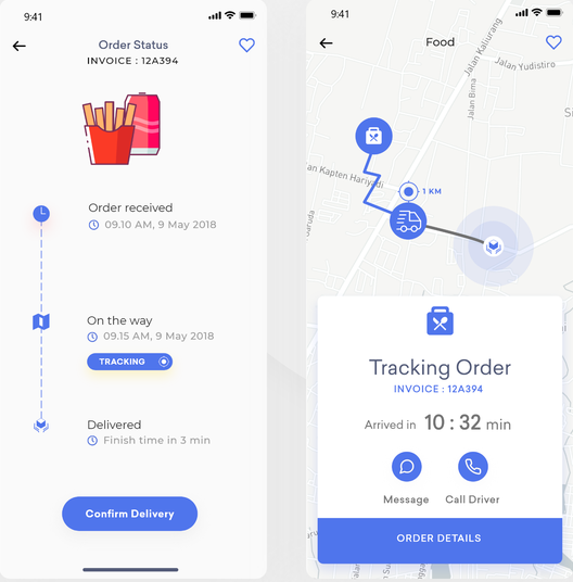
Delivery App

Source: Dribbble
Let’s start with the design for this food delivery order tracking app. Honestly, food delivery services have totally nailed this tracking order thing. While not a traditional ecommerce store, there’s a lot to learn from them!
This is a great example of innovative design being able to get away with the less is more frame of mind. Does this order tracking page have a ton of enticing CTAs or extra features? Nah, but it is expertly designed and chock full of all the necessary info customers need to track their orders. When your design is strong enough to do heavy lifting, there’s no need to bog down the order tracking page with any extra features, which is ideal for mobile users. Most tracking pages are only designed for web use, but knowing the majority of consumers check email on their phone these days, providing a mobile-optimized experience is a win-win.
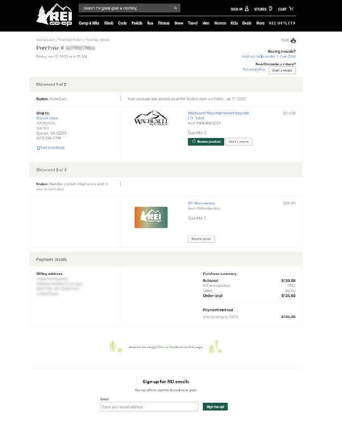
REI

Source: REI
The REI tracking page is a great example of consistent branding. Instead of going completely over the top with their design of this order tracking page, REI recognizes the power of concise, clean and branded design. Topped off with a couple CTAs at the bottom— one for company feedback, the other for being added to the email list— and REI has got themselves a perfectly designed order tracking page.
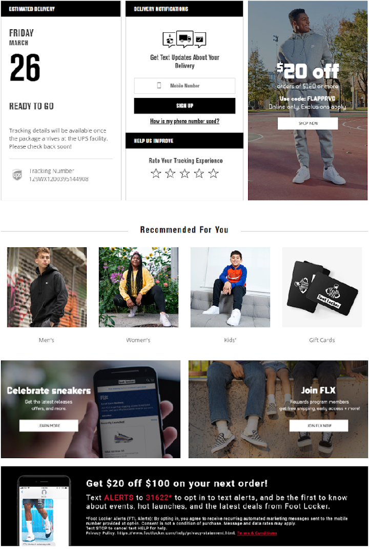
Footlocker

Source: Footlocker
The Footlocker order tracking page hits so many of the best practices— you can see clean graphics and multiple CTAs. Although I will admit that the bottom of the page does border on cluttered, the smooth design of the top half of the page more than makes up for it.
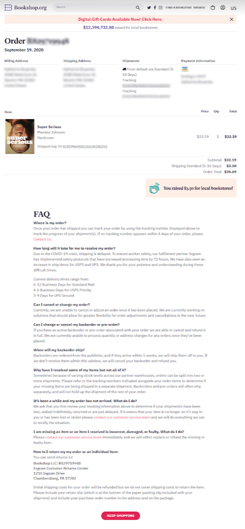
Bookshop.org

Source: Bookshop.org
Speaking of brands that design their order tracking pages based on their most common customer needs, Bookshop.org goes the extra mile here by including their complete FAQ section on their order tracking page.
You might look at this and say, holy cow, that’s a lot of copy! But content is king and education is invaluable. This FAQ, I would guess, likely reduces support tickets by a large margin.
This page finishes off with a popping “Keep Shopping” button and reminding me I supported local bookstores, this page is functional and stylish (like fanny packs or scrunchies).
Takeaways and recap:
- The best tracking pages reduce customer anxiety, deflect support cases, and connect consumers back to the brand.
- Order tracking pages can also increase upsells, cross-sells, and reorders. Aka: it can save costs and generate more in sales.
- Tracking pages, believe it or not, can be one of your most-trafficked web pages. But not if you’re sending customers to the carrier’s website.
- Design is important, but it’s more than pixels. As Steve Jobs once said, “good design is how it works.” Focus on form and function.
- If you can, build your tracking pages on your own domain vs another 3rd-party domain so you get all that link juice.
Are you looking for some more inspiration? Here are 10 Great Examples of Ecommerce Order Tracking Pages. Happy designing!!


