10 Great Examples of Ecommerce Order Tracking Pages

Anytime I buy something online, I know for certain that two things will happen. 1) I want the order as soon as I click ‘buy’. 2) An order tracking email will arrive promptly in my inbox once my goodies have been shipped, putting my pre-parcel anxiety at ease.
It’s what happens after I’ve opened the order tracking email, however, that can miss the mark. Depending on the quality of the order tracking email (or order tracking app) I will either check my expected delivery date on the carrier’s website, close out of the email, and move on with my day.
Or, I will get sucked into the order tracking page by a new discount code, exclusive offer, or recommendation for additional products, and before I know it I’m right back to shopping again.
So, what is it about these great order tracking emails that keep us coming back for more? To find out, I took a deep dive into my past order tracking emails to see what exactly it is that separates them from the rest of the pack. Read on to find out what I discovered!
Customizing order tracking pages to improve the ecommerce experience
The most effective order status pages are customized to include the company’s voice and branding, keeping the shopper in your shop’s aesthetic (versus, ya know, sending a customer off your website to USPS or FedEx).
Customizing your order tracking pages turns a typical transactional message into a marketing opportunity, and a one-stop-shop for buyers to see where their item is, leave a review, check out other products, or find a discount for their next purchase.
Order tracking pages (particularly beautifully designed ones that are easy for customers to navigate) improve the ecommerce experience all the while capitalizing on an otherwise untapped opportunity.
Benefits of optimizing the customer order tracking experience for Shopify brands
Sending order tracking emails to your customers is table stakes. But by leaving order tracking pages untouched, you’re missing out— big time. You could be turning these tracking pages into more dynamic shopping experiences helping to create more repeat, loyal customers.
With your brand’s own order tracking pages, you have the ability to offer to upsell and cross-sell opportunities with a few designed calls to action — like this one. Can’t do this on USPS, can ya?
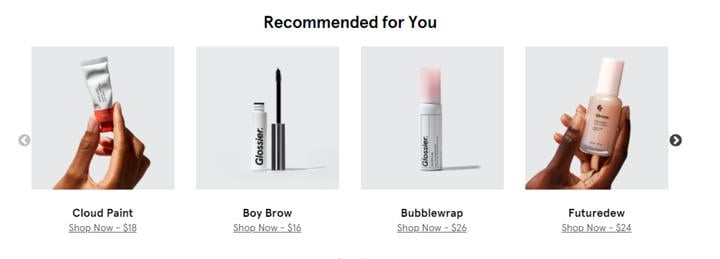
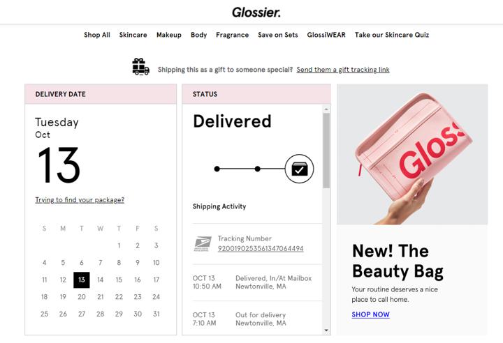
Am I a Millennial and did I get targeted by Glossier enough times to break down and buy their main product collection?
Yes. In true wannabe beauty guru fashion, this page made me interested in trying more products. Check, mate, Glossier.
If Glossier had sent me to the carrier’s website instead, I wouldn’t have discovered these other products.
Branded, personalized order tracking experiences make a difference.
Here are some numbers to prove it.
- Order confirmation emails have one of the highest engagements rates out of all marketing emails, with an average open rate of 65%
- Transactional emails, such as order tracking emails and order receipt emails, receive 8X more opens than regular marketing emails
With order update emails having such high open rates, why send all that traffic to the carrier’s website and not your own?
💡 Pro Tip: Are you looking for a Shopify app to help you create a stunning order-tracking page in minutes?
What's in a great ecommerce order tracking page?
So, what separates the good order tracking pages from the great?
A great order tracking page will tell you when your order has shipped and when you can expect it to arrive on your doorstep in a fresh and aesthetically pleasing fashion, with accurate, up-to-the-minute updates, all the while sprinkling some enticing CTAs around that pull you back in for more shopping.
Sounds easy enough! But before I show you some examples of truly great order tracking pages, let’s break this down a little bit more.
Detailed shipping updates
The primary purpose of order tracking pages is to inform the buyer of any and all shipping updates. A standard order tracking page will include:
- A breakdown of items in your order
- Shipping date and expected delivery date
- Order # and tracking #
- The billing address and shipping address
- A tracking link to see the details of your order’s shipping journey
Company branding, marketing, and social media
Let’s talk customization. A few ways to customize your order tracking pages is to:
- Incorporate your company branding to turn a boring transactional landing page into a marketing opportunity
- Add links to your company’s social media accounts
- Include FAQs, instructions, or helpful information about your products
- Include aesthetically pleasing graphics and that match the tone of your company landing pages
- Spice up the copy to match your overall brand voice
A place to review products
To keep your customers on the order tracking page for longer, incorporate a place for them to review their product purchases. It’s also good proactive to send out a separate “product review” post-purchase email after an order has been delivered, but we have found that incorporating a call for product reviews right on the order tracking page is a simple way to redirect customers back to the main ecommerce store page.
Exclusive discounts and offers
If you’re running a seasonal sale or are in the middle of an exclusive offer campaign, pop a CTA for these discounts on the order tracking page. Hot tip— add some urgency to these discounts and offers by noting how much longer they are running. “50% off all denim ends today!” is going to catch the eye and clicks more than a generic “Flash Sale!” graphic.
Customer recommendations for additional products
Sometimes your greatest resource in the effort for eCommerce retention is other customers. Try including a selection of customer recommendations for additional products on your order tracking pages. This not only works as a pitch for featured products but also reminds your customers that they are joining a club or community of like-minded shoppers.
Anthropologie uses its order tracking page to promote a few types of content and marketing in its signature design style, including a plug for its app.
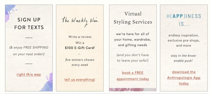
10 Examples of Ecommerce Order Tracking Pages
We have arrived at the main event! Here they are, my collection of order tracking pages that truly go above and beyond in terms of customization, CTAs, and overall aesthetic. Just one more thing before we dive into these examples: don’t judge my shopping habits! ;)
Wayfair
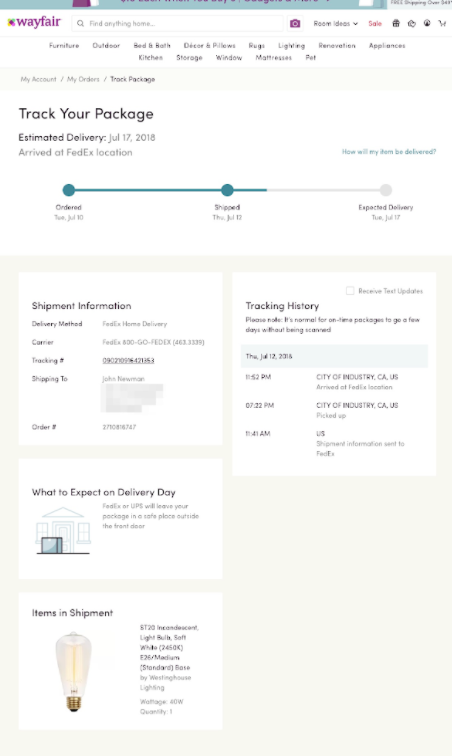
Source: Wayfair
What I love about this Wayfair order tracking page is how clean the graphics are. The vibe is completely in sync with Wayfair as a brand and incorporates all the shipping and tracking info the customer needs while including an additional infographic about what the customer can expect on delivery day.
Hermes

Source: Hermes
Hermes takes the classic image of an order tracking graphic and turns it on its head, literally. By incorporating a vertical tracking graphic instead of a standard horizontal one, Hermes is able to add their custom flair to a familiar image. Add the frequently asked tracking and delivery questions to the mix and you’ve got yourself a completely unique order tracking page with clean lines and all the necessary info.
Goldbelly
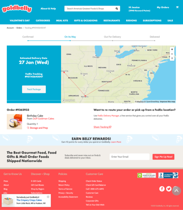
Source: Goldbelly
This order tracking page from Goldbelly pulls off a maximalist approach without being overwhelming. By incorporating a moveable map on the page Goldbelly has snuck in an interactive feature to the page before you even get down to the true CTA in the form of the “Earn Belly Rewards!” banner. This is a page users would come back to over and over again.
Native
Source: Native
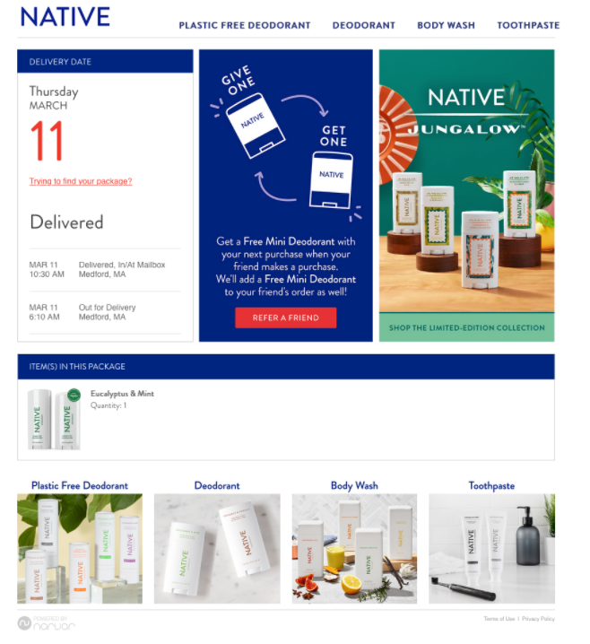
The order tracking page for Native maintains their brand’s minimalist, natural feel and encourages viewers to share the product with a friend. There is a wonderful balance on the page between the pointed copy that calls out to the customer and the block design that holds the whole page together. Native is able to incorporate a high number of CTAs without the customer even realizing they are being marketed to.
Victoria’s Secret
Source: Victoria’s Secret
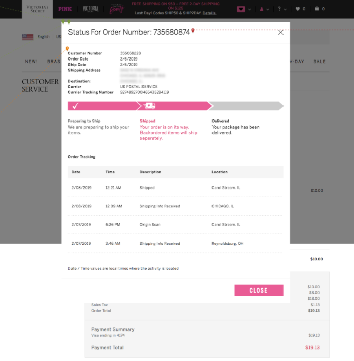
Sometimes the power of an order tracking page lies in its ability to deliver the necessary information without stepping on its own toes. Thanks to the meticulous timed break down of the order shipment phases, the Victoria’s Secret order tracking page answered all of my customer questions before I even had time to ask them.
Glossier

Source: Glossier
As I mentioned before, Glossier’s got me hooked. In addition to multiple tracking graphics and recommended products for one-click continued shopping, Glossier offers helpful resources, including a shipping FAQ page(!) (This is a great idea and customer support teams around the world will praise you if you do this!)
UGG
Source: UGG
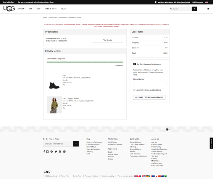
What takes this otherwise straightforward order tracking page to the next level is the inclusion of the option for text message notifications. Text message marketing campaigns are tricky to pull off, but this UGG order tracking page knows that before you can pull off a text message campaign the first thing you need to do is get your customer’s phone numbers.
Aerie
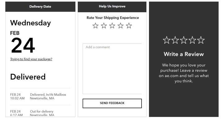
Source: Aerie
The top section of the Aerie order tracking page accomplishes more than some entire order tracking pages are able to do. By incorporating the option to rate both your shipping experience and write a review for your purchases with help from a simple design layout, this order tracking page manages to seamlessly incorporate multiple CTAs without breaking a sweat.
Hanna Andersson

Source: Hanna Andersson
On the other hand, the bottom half of this Hannah Anderson order tracking page does most of the work. By lining up graphics for additional shopping, a social media promotional campaign, and a site sale all in a row they are all but guaranteeing that I’ll continue engaging with their page… and that’s exactly what I did.
Domino’s
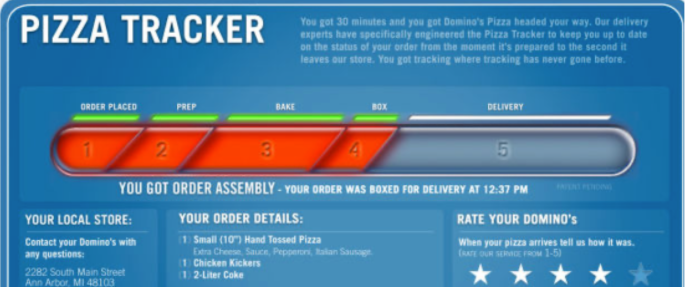
Source: Domino’s
Of course, no selection of great order tracking pages would be complete without the G.O.A.T. The Domino’s pizza tracker is a thing of legend (it’s even starred in its own commercial), and for good reason. It manages to incorporate a graphic that updates in real-time while not distracting from necessary information like order details, all the while incorporating CTAs such as a star rating system for your order.
With so many moving parts, the Domino’s order tracking page could easily derail but instead it stays on course thanks to its meta crowning glory, the boast on the order tracking page that what you are experiencing is “tracking where tracking has never gone before.” Domino’s knows its audience and its audience wants that pizza (in 30 minutes or less.)
There you have it, a collection of my favorite order tracking pages and the how to guide for creating your own!
About Wonderment
Wonderment is the post-purchase platform for Shopify brands who ❤️ their customers.
Send proactive shipping and delivery updates to your customers through our email and SMS integrations. Use our branded order tracking pages to reduce support tickets and create new revenue opportunities.
Ready to see this for your store? Get a demo today.


![The Ridge Reduces Shipping & Tracking CX Tickets With Wonderment [Case Study]](https://www.wonderment.com/hs-fs/hubfs/wondermentXtheridge_casestudy-1.png?width=500&name=wondermentXtheridge_casestudy-1.png)

