eCommerce Email Teardown: Brooklinen

I get a lot of email these days. I also unsubscribe from a lot of email. Probably at the same rate I sign up for them.
It's hardly my intention, of course. The relationship always starts off promising. After all, the teasing of flash sales and the whispering in my ear of member-only discounts just sweeps me off my feet. Every single store had me at "hello, want 20% off?"
But then after the 50th "hurry! buy now!" email that day, the relationship has become desperate at which point it's time to say goodbye.
I get it. Email is the necessity of all eCommerce sales like oxygen is to breathing. The amount of email you send is directly correlated with your sales numbers and it's one of the most important channels there is to reaching and nurturing customers.
Not all merchants suffer the same fate ending up in my unsubscribe folder, though. When I receive email from a merchant I don't mind getting often, well, that's something worth sharing!
What eCommerce Merchants can learn from Brooklinen's email strategy
According to Statista, there will be 320 billion emails sent every day by 2021 [TWEET THIS STAT]. That's a lot of noise, which means staying relevant in your customer's inbox is no longer a nice-to-have.
One of the DTC brands that I admire is Brooklinen - a company that sells luxury sheets, bedding, and goods for the home (my entire house is wrapped in Brooklinen bedding!).
On the email frequency spectrum, the company is walking a fine line of hitting my inbox too often (approximately one email every other day, but it's far less than the 3 to 5 emails a day I get from other merchants - I won't name names).
Despite the regular check-ins, the difference with Brooklinen (and perhaps why my trigger-happy finger stays away from the unsubscribe link) is that their emails are...different. They don't feel aggressive or overly sales-y like most promotions do.
To uncover what make's Brooklinen email campaigns so great, I'm going to share a few examples and dive into the different types of communications.
5 Takeaways from Brooklinen's Email Strategy
1. Knowing when to stop selling.
Send email that doesn't try to sell anything at all? Blasphemy!
But, yes, there are times when the right thing to do is to press pause.
In light of recent events surrounding George Floyd, the founders (who refer to themselves as just Rich & Vicki) took the time to recognize the Black Lives Matter movement and take action regarding ongoing racism and injustice. Here is their recent email:
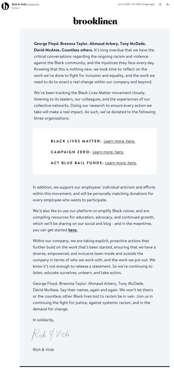
Communications like this are what shines a light on your brand, what you value, what you stand for, and who you stand with. As long as it's authentic, transparency is the best form of marketing.
The second thing I should point out is how important it is, as founders of your company, to reach out to customers - at least occasionally. You are human and so are your customers. They will feel less like a number if you reach out and say "hey, how did you like your most recent purchase?" or "hi, I noticed you haven't clicked on our emails in a while, what can we be doing better?"
Think about it, most mega-brands do not send messages from the CEO (and when they do, it's only major issues or events, like when their company is hacked). One of the sole benefits of being a DTC brand is having a direct connection with your customer - leverage it!
2. Customer exclusivity
As a customer, I am the first to get early access to sales and notifications when new products drop. I know this because they don't let me forget. :)
Here's an example of a recent campaign where they promoted a sneak peek of an upcoming event:
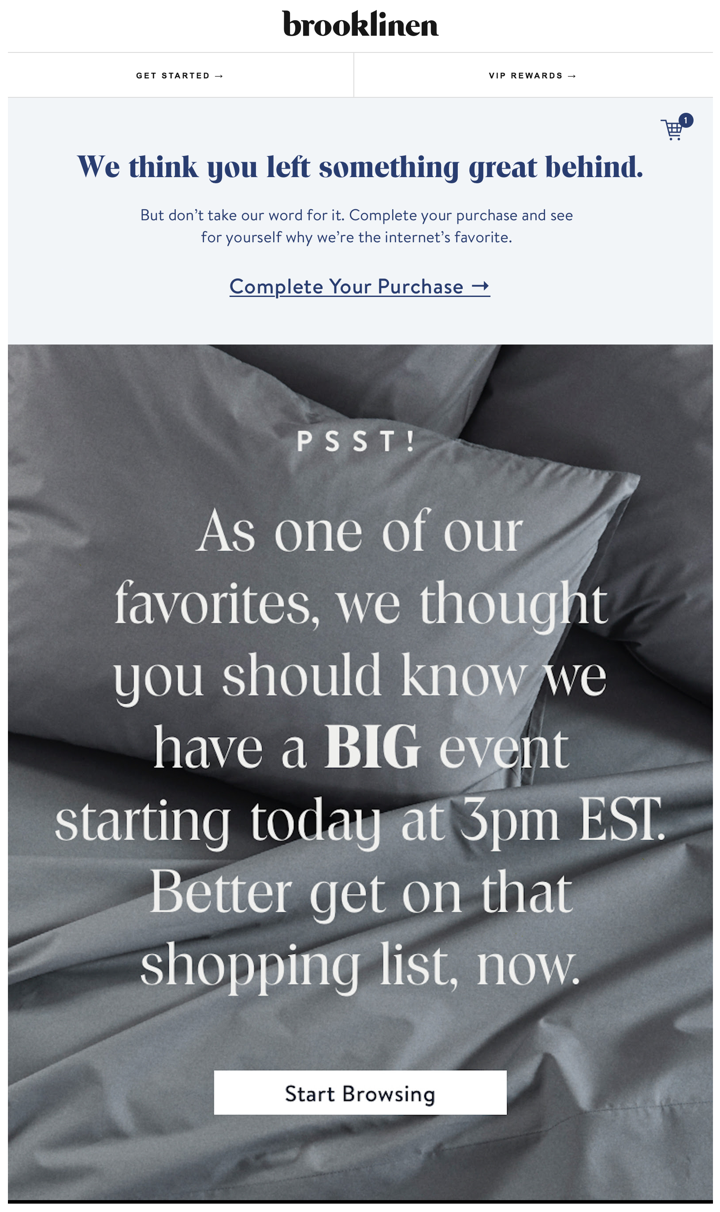
This makes a ton of sense - it's good to remind customers they are special. In Brooklinen's case, they promote their sales before major holidays and events and share those deals with customers first. This enables them to kick-off their sales goals early while rewarding their best customers. A win-win.
3. A touch of humor
Brooklinen is a brand that doesn't take itself too seriously. Just take this subject line for example...

Or check out this new product launch for scented pillows, which so happens to be on April Fools day.
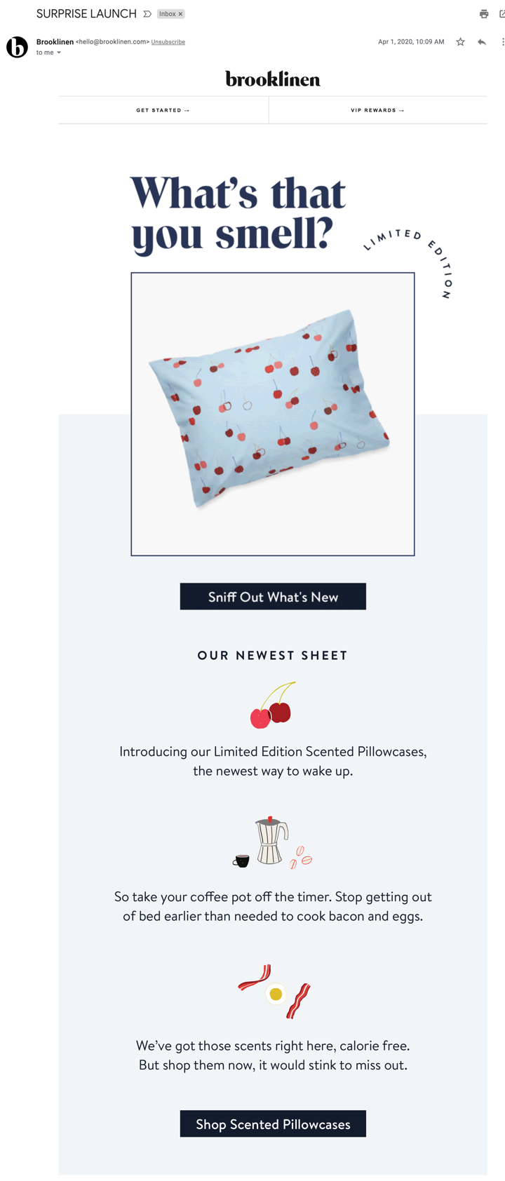
Humor can be a tricky thing to nail email but if you stay human and light-hearted (and most importantly not tone def, timing if everything), it will feel less forced or fake.
Jokes aside, I would legit pay for a scratch and sniff pillow. Who's with me?
4. One concise message
What I love about Brooklinen's emails are what's not in them.
They are lightly designed and to-the-point. They are the opposite of a giant JC Penny flyer (RIP Penny's). It's as if a human wrote them and not a machine. It doesn't feel like you're getting an email from a large retailer corporation who could care less about who you are.
Many of their emails are visual and beautifully designed but not chaotic. Some are purely text-based, which is different (even though the entire message is one image, a discussion for another time). But the most important distinction is that typically their emails focus on one offer or one call-to-action. That's it.
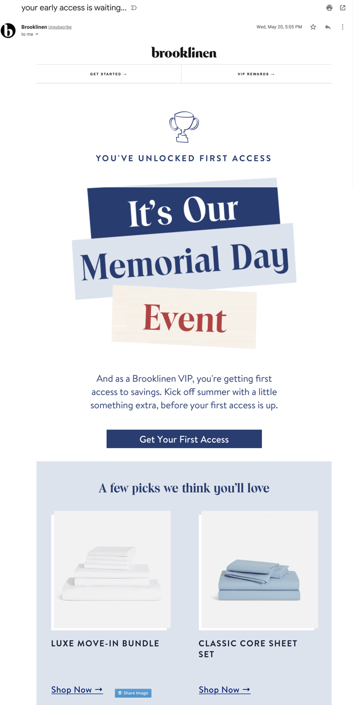
Even if you're a small shop without the resources to create custom templates, don't sweat it. It's the content and the calls-to-action that matter most. The design just happens to be very on-brand for them, if you don't have that level of design yet, you can get away with amazing email if you master the offer and the message!
5. Value-driven cart abandonment
What's unique about Brookinen's cart abandonment emails compared to most eCommerce email is that they rarely mention the product(s) that are in your cart.
Instead, they lead with value. Check this out:
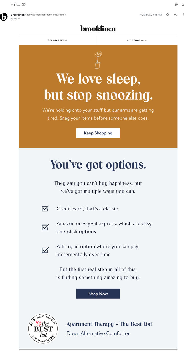
Including this copy is smart. They do this to help ease the potential for buyers' remorse and to help increase purchase confidence. They are teller me (the buyer), hey, trust us, you will love what you buy. But just in case you don't, we offer hassle-free returns.
Addressing buyer concerns upfront is a good strategy to increase conversion rates in letting them know they are buying from a trusting and reputable source.
Recap
Brooklinen's email strategy isn't perfect of course but there are several takeaways to keep in mind for your own eCommerce brand:
- Write like a human. Copywriting becomes so much easier when you write like you talk and don't take yourself too seriously. With all of the sales promotions consumers receive in their inbox on a daily basis, you will instantly stand out if you create content as if it's from a real person.
- Focus on creating a stellar offer. You can have the most beautiful email in the world, but if the content sucks, it won't convert. Leverage exclusivity and urgency to create offers that make your VIPs feel special. And don't muddle your emails with tons of different offers or different calls-to-action. Keep it simple!
- Dare to be different. Yes there are lots of best practices out there on when to send email and how to send me - it's all down to a science. But Brooklinen's email is just so different from most eCommerce emails I get that it's a refreshing change.
Are you a DTC brand looking to increase AOV and customer retention? If so, we'd love to hear from you.


![The Ridge Reduces Shipping & Tracking CX Tickets With Wonderment [Case Study]](https://www.wonderment.com/hs-fs/hubfs/wondermentXtheridge_casestudy-1.png?width=500&name=wondermentXtheridge_casestudy-1.png)
