7 Awesome Product Upsell and Cross-selling Examples

Imagine standing in line at the grocery store as you wait to unload all the items from your cart. Look to your left. What do you see? Shelves stacked with magazines? A fridge stocked with water and soda? Now look to your right. Do you notice the rows of candy, lighters, bug spray, and toys?
What you see is a practice found almost everywhere we shop and buy... and it works.
Upselling and cross-promoting products before checkout is a universal and common technique in retail. Not only in grocery endcaps and checkout aisles but in stores that sell apparel, cosmetics, and home goods. Even fast-food chains like McDonalds have made product add-ons famous (would you like fries with that?).
Product upselling has reigned in retail but has now made it's way to the digital shelf. Today, eCommerce merchants look to upselling and cross-selling as a way to increase Average Order Value (AOV) and Lifetime Value (LTV).
But more importantly, when done right, upselling improves customer satisfaction. The best brands leverage upselling as a way to guide customers to the right products at the right time, not just to "sell more stuff."
For example, let's say you're buying a new area rug for your living room. Before you purchase the rug on a merchant's website, it would helpful for the merchant to suggest a rug pad of the same size before checkout. Why? Because it saves you (the consumer) a ton of time shopping around for rug pads, or realizing weeks later that perhaps you should have bought one (not that I would know or anything. Cough cough).
Let's be clear though, great cross-selling is not just about inserting fancy product recommendation carousels on your website. It's about being strategic and helpful about what products you present when and where in the buyer's journey.
The best upselling happens across marketing channels, meaning it's not just implemented on product pages alone but across multiple touch points: on your website and in email, social, and print. This is why retailers have mastered upselling, it's all about creating irresistible offers in the right place and at the right time.
For the sake of simplicity, however, we're going to explore 7 great upselling examples on a merchant's storefront and save omnichannel examples for a future post. If you're just getting started or fairly new to upselling products, starting with your storefront and the checkout can have quite a big impact on conversion.
So let's get to it, shall we?
10 Examples of eCommerce Upselling and Cross-selling
1. Hilton Garden Upgrade
A lot can be learned from the Travel industry when it comes to upselling, and that's an understatement. Hotel and airline companies in particular have mastered the online upsell and cross-sell.
Think back to every time you booked a flight or hotel room (you know, in pre-covid times) and how often you received offers to add a car rental to your purchase, or an offer to upgrade your seat to extra leg room, or the chance to purchase discount tickets for a tour in the area of your destination.
Even if you're a very small business and in a completely different type of market (say CGP or Fashion or Gaming, etc), there are many takeaways from how Hilton suggests a room upgrade during the checkout process, seen here:
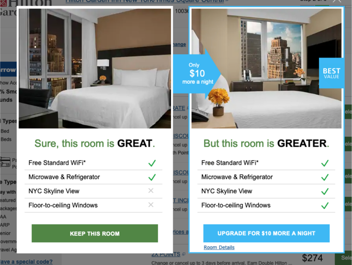
Consider this an inspiration, say, if you have multiple variants of a particular product. For example, if you sell multiple packs of the same good (a 2-pack, 4-pack, and 6-pack). Why not encourage the customer who added the 2-pack to the cart to upgrade to the 4-pack? Or, if you sell similar products at various price points instead of different sizes (good, better, best options), you can suggest an upgrade from the cheapest option to the middle tier product.
Note that Hilton's call-to-action promotes value and not a discount. "For only $10 more a night you get all these extra things!." Discounts are often used in upselling but that doesn't always have to be the case!
2. MVMT Product Add-Ons
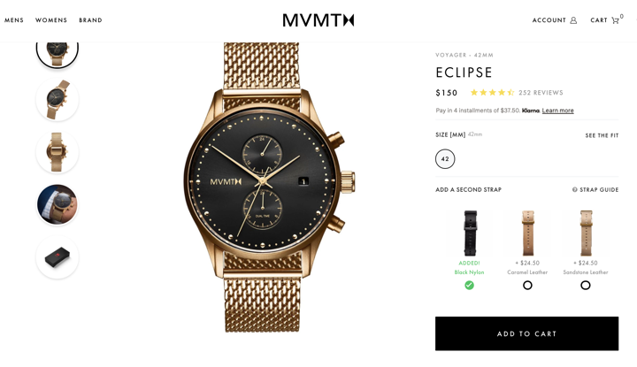
Many merchants worry that promoting additional products can cause friction in the buying process. It's a legit concern. In-cart product promotions can hurt conversion it it overwhelms the buyer or causes friction in some way. But when done beautifully, like in this example from MVMT, cross-selling can work wonders to increase AOV.
In this example, MVMT gives customers the option to add a second watch strap to their purchase for around $25. For a $150 watch, this is the perfect accessory to upsell.
The way it's designed into the product page is very minimal, nothing flashy here. Just click one of the circular radio buttons under your favorite strap option to add that item along with the watch. Simple but brilliant.
3. Chubbies Unique Summer Promotion
Who said upselling can't be fun?
In this case, Chubbies runs a "Julyber Monday" sale every summer and combines great prices with rewards for hitting specific order value thresholds.

It's smart for multiple reasons:
- Gifts and sales don't kick in unless multiple items are added to the cart, instantly increasing AOV. It also prevents sales of just one item, which can be a killer for shipping and logistics costs.
- It's a great reason to run a sale during the summer, typically a time when sales might be slower for the apparel brand.
- Customers feel as if they are being rewarded. This in itself is a win-win for the merchant and the customer.
It's like a gamification of upselling. What's not to love?
4. Bed Bath and Bundles
Across many categories of products, it's common to have a "hero" product and smaller or less-expensive accessories that complement or pair well with that product.
In this example from Bed Bath and Beyond, where I'm buying a toaster oven (it's a great toaster by the way), they are promoting two additional add-ons here in the checkout:
- A protection plan or warranty (appropriate when buying an appliance)
- Accessories, or complementary add-ons to my purchase (Breville cutting boards).
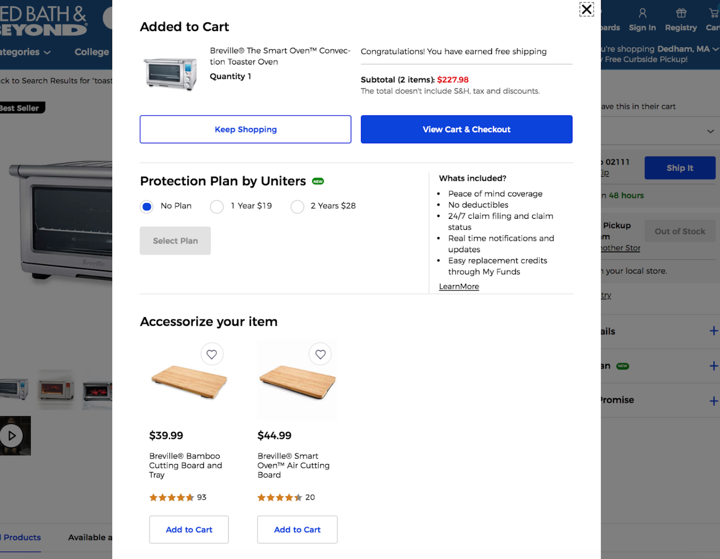
I don't know if cutting boards are the best products to promote with this toaster oven (would other products convert better?) but it's certainly not a bad suggestion. And it would have been better if they only presented one of the boards (the one that best matches the oven in the cart).
How this upsell is designed is also friction-free. Accessories are slightly below the fold and there are "add to cart" buttons which add the items instantly (versus redirecting that traffic to the product pages). I still redirect myself to the product page to learn more if I want - which is important. Always make it easy for consumers to add items to the cart but don't prevent them for getting more information if they need it to increase purchase confidence.
5. Brooklinen's Free Gift with Purchase
Sometimes the best examples are the simplest and this is no exception.
This example from Brooklinen, a provider of luxury bedding, built a full-page call-to-action for a giveaway. The offer is straight forward: spend at least $100, get two free pillows.
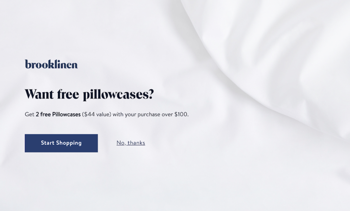
Normally I suggest shying away from full-page CTAs, they can be rather annoying for consumers. But how I got served this CTA makes all the difference: I arrived on this landing page by clicking on the offer (for the free gift) within an email campaign. This CTA reconfirms I'm in the right place and that the offer is still available. It's a best practice to match the copy in an ad or email with what's on the lander.
6. SuperGoop's Best Seller
Many of the upsell examples in this post are ones that leverage items already added to the shopping cart - but what if there are no items at all?
SuperGoop has an answer, simply insert a CTA of your best-seller product right within the empty cart!
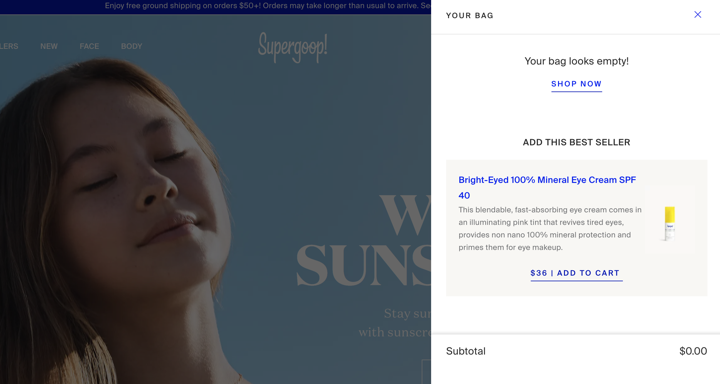
This is a great way to promote your best seller and help remove the complexity of choice for the buyer. And best of all, it's super easy to implement.
Try this tactic for different seasons, promotions, or discounts. Consider A/B testing the CTAs to see which offers perform best.
7. B&H Better Together
I consider myself an uneducated consumer when it comes to buying audio and visual equipment. But one day I needed to purchase new podcast gear and was overwhelmed by choice.
After researching, I decided to purchase from B&H and noticed the unique ways in which they cross-promote products.
Take these call-outs in the checkout, for example. B&H combines both cross-selling ("Add Accessories to Cart") and product bundling ("Buy Together and Save") in one experience but under two separate modal windows.
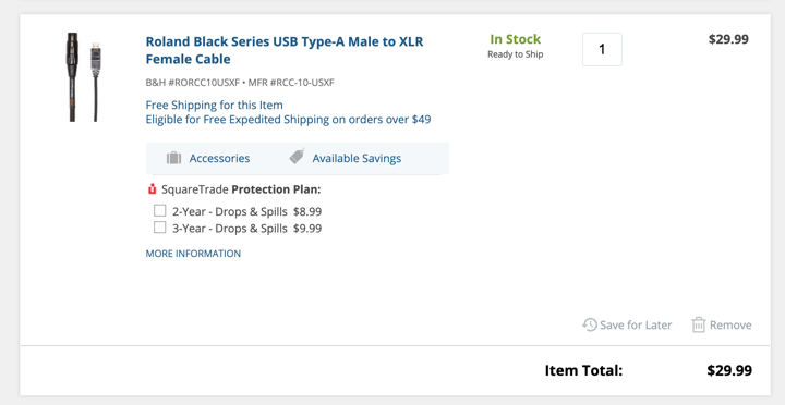
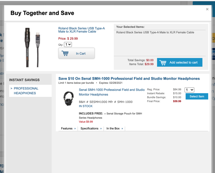
Yes, the screen is a bit cluttered and not very beautiful. I would say the same for Amazon, which as we all know, performs really, really well. A pixel-perfect design is not always better.
But what I love most is the bundling of the headset with the item in my cart and how they expose the savings front and center. The "Buy Together" modal only promotes one product (studies show too many choices can paralyze buyers) and clearly indicates me how much I'm saving. Not to mention - the free gift with purchase!
Even if you're not a mega-retailer like B&H, there are a few takeaways you can apply to your own storefront, such as bundling multiple products and pairing those products with a discount or free gift (if the economics work in your favor).
Conclusion
If you ever thought creating upsell promotions would be too complicated, I hope these examples give you inspiration to get started. Whether you're a very small business or large retailer, cross-selling and upselling products can make a huge difference on your bottom line.
And if done right, can help improve customer loyalty, too.
Are you a DTC brand looking to increase AOV and customer retention? If so, we'd love to hear from you.


![Latico Leathers Drives High-Margin Revenue With Wonderment [Case Study]](https://www.wonderment.com/hs-fs/hubfs/wonderment_Latico_casestudy.png?width=500&name=wonderment_Latico_casestudy.png)
